This is the second part of our Product Page Design blog post. To see the first part check the link out here.
If you’ve seen any of Oreo’s marketing, you shouldn’t be surprised they’re on this list. But sometimes, being well known can actually make it harder to create a product page. Let’s see how they did it.
Oreo’s focus on their product page is showing how Oreos can help you unleash your imagination, dare to wonder, and become a generally happier person. It features a series of videos, one after another. In one about sharing Oreos with friends, the lyrics go, “If I gave ’em to my friend in the hallway, would he keep an optimistic outlook all day?” This page takes an out-of-the-box (pun intended) approach to marketing what could be thought of as just an ordinary cookie.
Oreo also has a unique approach to the design of this page. Even though Oreos are just black and white, the page is wonderfully colorful, from the videos to the backgrounds to the graphics.

[Click here to see Oreo’s full product page.]
Before I started writing this post, I asked a few people for suggestions on their favorite product pages — and you’d be amazed how many people immediately recommended Fitbit. So I checked out their site … and they were right.
The page starts off with a value proposition, not a feature list. Specifically, it’s a hero image of people hiking a mountain, presumably wearing Fitbits, along with the copy, “Energize your day.” As you scroll down the page, it goes through four quick steps explaining how the product works (and why it’s valuable).
As an example, the feature is tracking everything you do from walking to running to sleeping. Why does it matter? So you can have this information at your fingertips and have something to beat. When users click on a feature explanation, the image to the right animates to show what you’d see on the screen on a Fitbit when activating that feature.
Aware that users will likely walk away from their page not remembering all of the specific features, Fitbit was sure to focus on conveying the difference each feature will make in their lives. Well played.

[Click here for Fitbit Charge’s full product page.]
Volkswagen takes an interactive approach to their product marketing. Instead of listing out all of the features you can have in a car, they walk you through the process of actually buildingyour car. As you go through that process, Volkswagen highlights the different features you could choose, then gives you a preview of what the car will look like and how that will affect the price.
(If you want to see a regular product page, they’ve got that, too.)

[Click here to see Volkwagen’s full product page.]
The folks at Seattle Cider claim their cider is “not your standard cider.” Well, neither is their product page. It’s a beautifully designed page that reads kind of like a story. It begins with attractive, up-close images of their cider selection, which happen to have really cool label designs. As you scroll, they explain what differentiates Seattle Cider’s product from other, similar products using descriptive words.
But my favorite part is what comes next: a really cool, interactive story of how the cider process works from start to finish, which plays for users as they scroll. This is an example of surprising and delightful user experience that goes above and beyond your typical product page by showing not only the products they sell, but how they’re actually made.

[Click here to see Seattle Cider’s full product page.]
OfficeSpace Software sells facility management software to help you manage your office space. Their product page is very clear and direct.
Each section of this product page is dedicated to a different feature. The headline explains the feature, and the subheadline explains why this feature is important as you evaluate different software. That makes it easy for prospects to quickly digest what the product offers, but also get into more detail about its value proposition if they choose to. There are also clear calls-to-action if someone wants to learn more about a particular feature.

[Click here to see OfficeSpace’s full product page.]
Our high quality print can be in your finger tips within 3 days. Specialising in business printing.
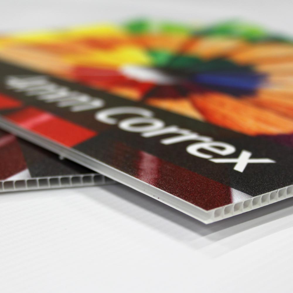
Experts in sign printing from correx, foamex and shop facias to banners and window graphics.
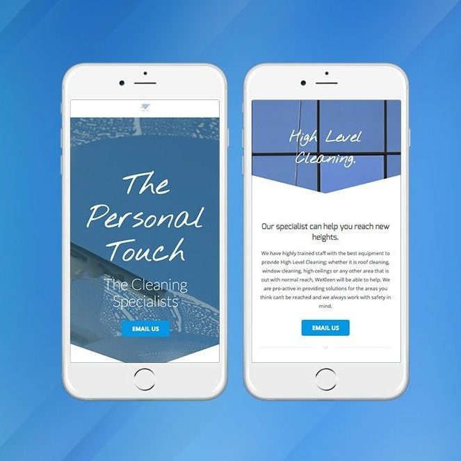
Our website design team will work with you on your website, from initial ideas to final live site.
Our full service design team can create transform your concept to completion